Charts
# General
Once you have created a simulation, you can examine it in the evaluation area.
Charts form the core of the evaluation area. Charts are used to clearly display the data of one or more simulations, depending on the chart type and configuration.
Any number of charts can be created in the evaluation area. You can close charts at any time; they remain saved automatically until they are explicitly deleted.
The charts in simcision are interactive. You can move the mouse over values in the chart to find out more about them. You can change the shape and color of the charts. If a simulation that is represented by a chart changes, the chart automatically changes with it.
Finally, charts can be exported as images. This makes the results from simcision available to other formats, such as reports (in PowerPoint) or even social media posts (#simcision)!
# Chart tab
Each open chart has an associated tab. The tabs can be rearranged using drag and drop. Clicking on a chart tab opens the corresponding chart.
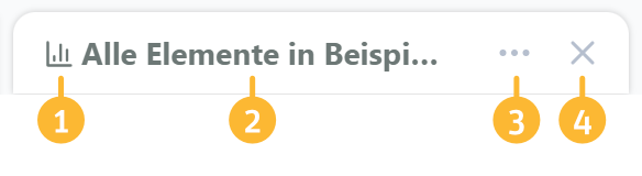
- Chart type symbol
The chart icon allows you to recognize the type of chart at a glance. - Title
Each chart has a title. By default, the title is generated automatically depending on the chart settings. However, you can also replace it by renaming the chart. To do this, simply double-click on the title. - Open context menu
The context menu contains chart-related commands. - Close tab
The chart can be closed at any time. The data entered remains saved. You can reopen the chart from the menu at any time.
Context menu
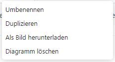
The context menu can be used to perform various actions for the assigned chart.
- Rename: Change the title of the chart
- Duplicate: Create a new chart with the same data and settings
- Download as image: Open image export dialog
- Delete chart: Permanently delete the chart. Once a chart has been deleted, it cannot be restored.
# Chart area
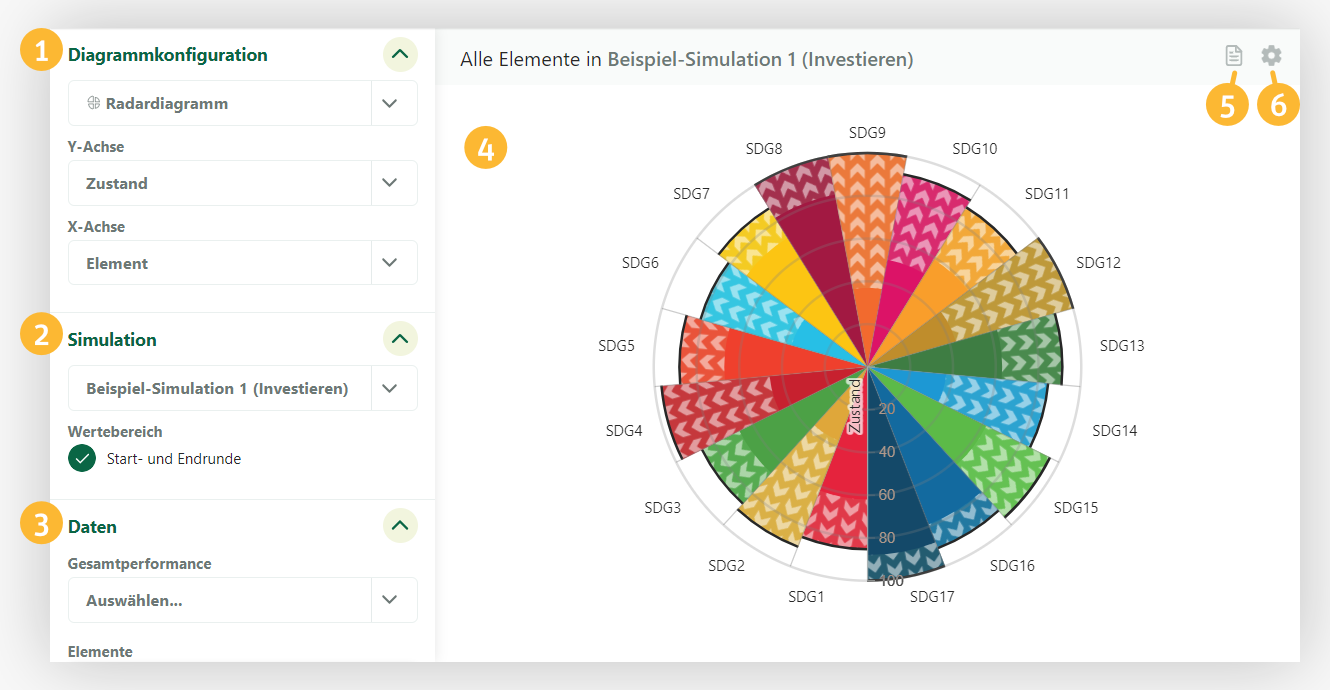
- Chart configuration
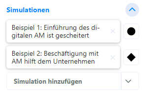
The chart type and the axes of the chart can be defined here. - Simulation
The simulations of the chart and the displayed rounds can be defined here. - Data
Here you can select the data to be displayed in the chart. - Chart
The generated chart is displayed here. - Show legend
The chart legend can be shown or hidden using this button. - Show chart settings
The chart settings can be shown and hidden using this button.
# Chart types
There are four different types of charts that can be used to display data in different ways.
Each chart type has different axis settings available.
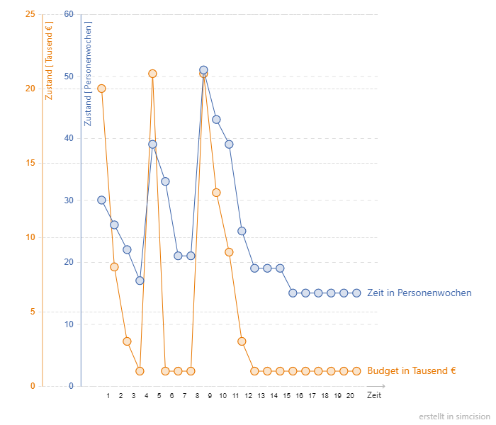
Line chart
The line chart can be used to compare the progression of several elements over time.
Available axes:
- Status / Time

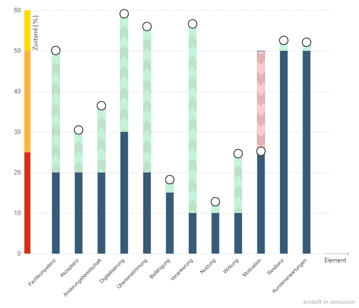
Bar chart
The bar chart enables a precise view of the state changes and influences of a simulation.
Available axes:
- Status / Time
- Change of status / time
- Pulses / time
- Status / Element
- Change of status / element
- Pulses / element
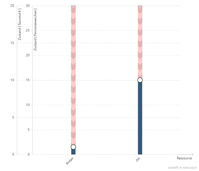
- Status / Resource
- Change of status / resource
- Impulses / Resource
- Effect / Element
- Effect / Resource

Spider chart
In the spider chart, several points in time of one or more simulations can be clearly compared with each other.
Available axes:
- Status / Element
- Status / Resource
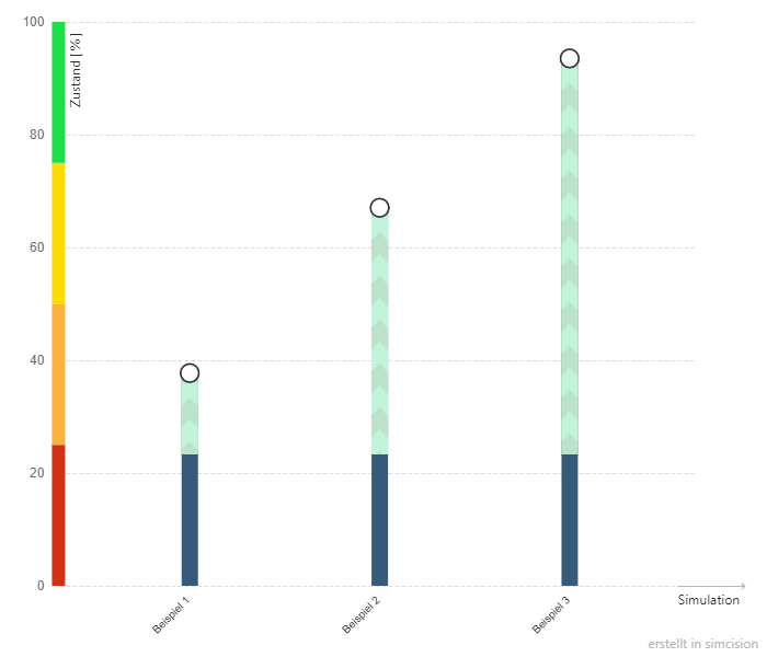
- Status / Simulation

Pie chart
The pie chart can be used to clearly display the states and state changes of a simulation.
Available axes:
- Status / Element
- Status / Resource
- Status / Simulation

# Axes
Status
The chart shows the current status of the selected objects.
In addition to the actual state, the difference to the initial state is shown in color (change in state).
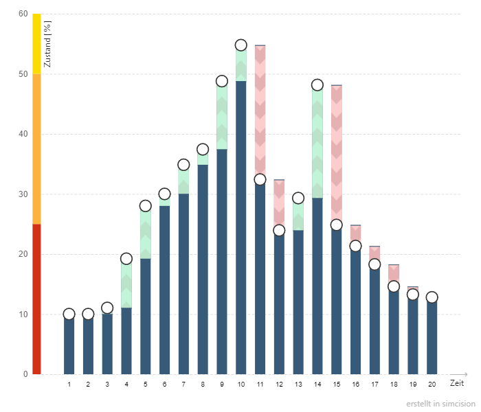
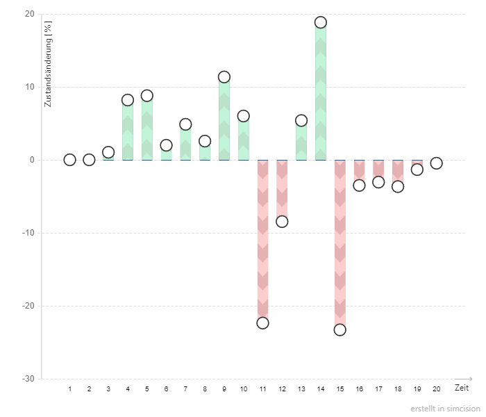
Change of Status
The chart shows the delta between the initial status and the final status.
If time is considered in the X-axis, the start state always corresponds to the start of the respective round and the end state to the end of the round.
If individual objects are considered in the X-axis (e.g. elements), the start state corresponds to the state that the object had in the first round of the round range and the end state corresponds to the state in the last round.
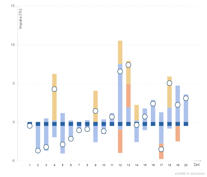
Impulses
All influences that have changed the selected object are listed separately in the impulse chart.
The impulses are sorted by influence value and type and color-coded by type.
The final state normally corresponds to the sum of all positive and negative influences. This should correspond to the value of the “Change of state” axis.
Example:
In round 10, the considered element “The AM is used in the projects” is increased by 5.5 points by an impact relationship of the element “All participants are empowered”.
In addition, an event occurs that increases the element by 15 points, but this is offset by another event that reduces the state of the element by 15 points. Effectively, therefore, the state of the element is only changed by 5.5 points in round 10, although impulses totaling 35.5 points were applied to the element.
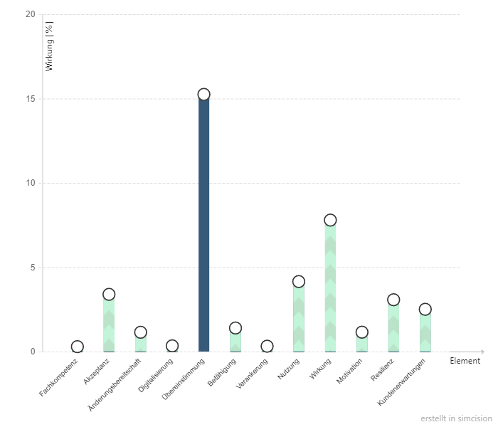
Impact
The impact chart shows all the effects of an external influence, e.g. an action.
Direct effects are marked in blue. These are effects that were calculated immediately when the influence occurred in the simulation.
Indirect effects are marked in green or red. These are effects that have arisen from the direct effect via impact relationships in subsequent rounds.
Time
Each point on the X-axis corresponds to a simulation round.
Element
The elements in the X-axis can be used to directly compare different element states.
Resource
With resources as the X-axis, resource values can be compared directly with each other.
Simulation
This allows the overall values of individual simulations to be compared with each other.
# Select simulation and rounds
Depending on the selected chart type, one or more simulations can be selected. If several simulations are selected, a symbol can be assigned to each simulation; this symbol is used in the chart for the values of this simulation.
The selected simulations can be exchanged at any time.
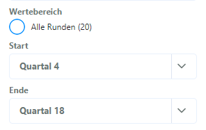
Depending on the chart type, all laps, the first and last lap or only the last lap are displayed by default.
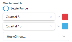
It is also possible to examine a specific time range of the simulation. If the “All laps” box is unchecked, you can specify exactly which laps are to be viewed.

The start and end points can be set freely.
Simulations are only ever displayed up to their last simulated round.
Example: Several simulations have been selected. Simulation A has 20 simulated laps, simulation B only 10. In the laps menu, it has been set that data from lap 11 to 20 should be displayed. However, only data from simulation A appears in the chart, as there is no data for simulation B after lap 10.
It is possible to select individual rounds in the spider chart. In this case, a color can be assigned to the rounds to distinguish them from each other in the chart.
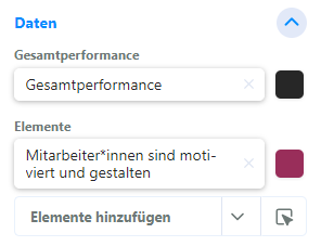
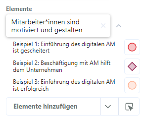
# Data
The data that can be selected in the data area depends on the settings in the “Chart configuration” area. Depending on the chart type and axes, other fields that can be set are displayed here.
It is sometimes possible to show the data of several objects in one chart, e.g. in the line chart. You can freely sort the objects and remove (by clicking on the small x) and add (via the input field at the bottom) them as required.
In some charts, you can assign individual colors to the displayed objects to make them stand out visually. The color can be freely selected.
By default, elements take their background color from the effect grid. If the color of an element is reset in the color picker, the color reverts to the color in the effect network.
Example: The “Motivation” element is blue in the network of effects. It was previously colored red in the chart. Now the color of the element in the chart is reset. The element is now also blue in the chart, just like in the network of effects.
If data from several simulations is displayed in a chart at once, it is also possible to assign different colors to the objects for each simulation. To do this, the color range can be expanded and each simulation can be given its own color.
# Chart settings
The chart settings can be used to visually adjust the currently open chart. All settings are permanently linked to the chart; similar charts with different settings can therefore also exist.
The chart settings can be opened via the cogwheel in the top right-hand corner.
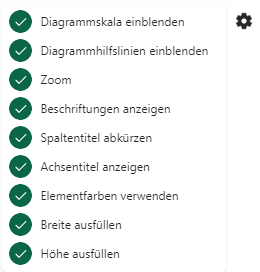
| Show chart scale | Show or hide Y-axis numbers |
| Show color scale | For charts in which elements occur: shows the color ranges of the element values next to the scale. Standard: Green for high states, red for low states. (Customizable in the settings) |
| Show chart help lines | Hides/shows the horizontal auxiliary lines for value steps. |
| Zoom | If selected, unused value ranges are truncated. Example: There are three elements in a line chart. The lowest value is 30, the highest 60. This sets the value range of the chart to 30-60, the lines now extend over the entire height of the diagram. |
| Center Y-axis | Fix the Y-axis so that the zero point is at half of the chart, so that the range of positive and negative values is exactly the same. |
| Show labels | Displays the labels of the objects in the chart. |
| Shorten column titles | Displays short titles under the columns instead of writing them out. |
| Shorten title | Displays short titles as object labels instead of writing them out. |
| Display axis title | Labels the axes of the chart (e.g. “Time” for the X-axis) |
| Display final states | Displays small dots in the chart at the end states of the columns. |
| Display external influences | Only in charts over time. Displays small symbols below the chart that indicate in which round which external influences (actions, events, impulses) had an effect on the network. |
| Use element colors | Colors the bars of the chart in the colors of the elements. If this option is not activated, the bars are colored depending on the value: Blue for the status bar, red for loss, green for gain. |
| Weight values | Only available in the spider chart. If the elements in the model are weighted differently, the axes of the diagram are scaled according to the weighting of the associated element. Elements with a relatively low weighting thus become smaller. |
| Fill width | Automatically adjusts the chart to the full page width. If this option is not activated, the width can be set manually. |
| Fill height | Automatically adjusts the chart to the full page height. If this option is not activated, the height can be set manually. |
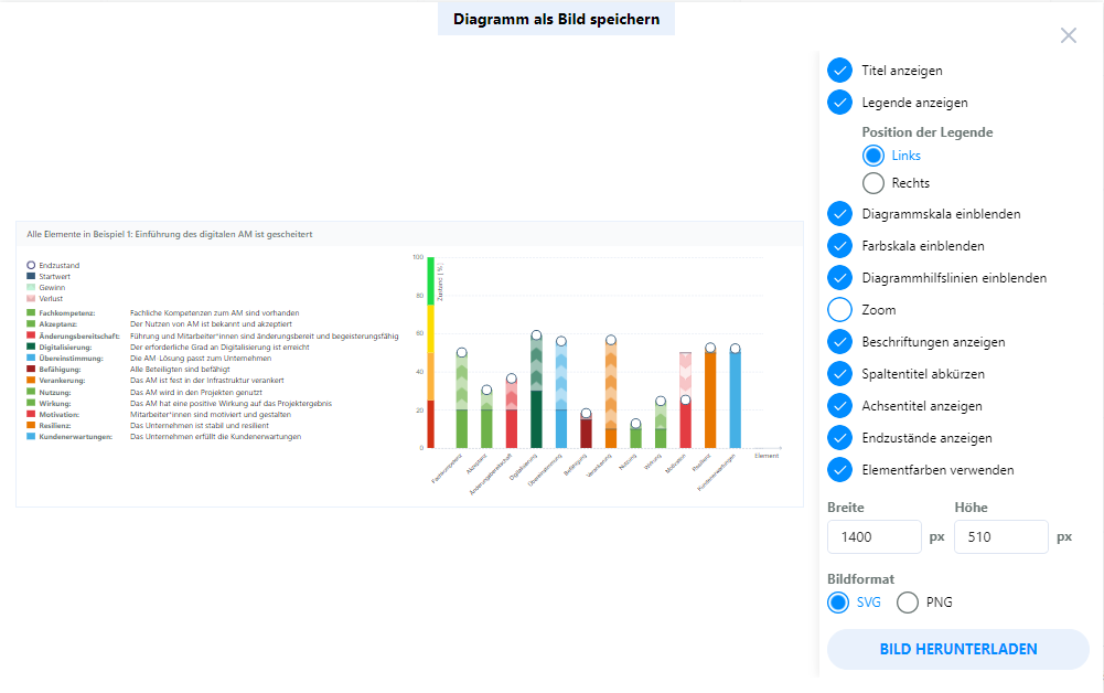
# Image export
In the image export (accessible via the context menu of the tab), the chart can be exported as an image. The export currently supports SVG and PNG formats.
An individual image size can be set here. You can also adjust the chart settings for the export once again. The changes made here do not change the chart, but only change the exported image.
You can see a preview of the exported image on the left-hand side of the export window. If everything looks correct, you can download the image by clicking on “Export image”.